OZ Steakhouse delivery app

Project Overview
OZ Steakhouse is an Australian-themed restaurant that aims to bring their menu directly to their customers' homes. With a diverse range of Western cuisine, the restaurant targets busy commuters and workers who may not have the time or energy to prepare meals themselves, particularly for special occasions like parties or family dinners.
Role
UX designer designing an app from conception to delivery
Responsibilities
User Research
Conducting interviews
Paper and digital wireframing
Low and high-fidelity prototyping
Conducting usability studies
Iterating on designs
Duration
December 2021 to May 2022
Problem
Busy workers don’t have enough time to prepare meals or party food.
Problem
Busy workers don’t have enough time to prepare meals or party food.
Goal
Design an app for OZ Steakhouse that allows users to easily order and have Western food delivered to them on special occasions or anytime.
User Research
I conducted a series of interviews to gather valuable insights into the target user group. While I initially assumed that working adults were primarily limited by a lack of time, my research revealed that there were other significant factors to consider. These included obligations, interests, or challenges that made it difficult to obtain the necessary ingredients for cooking or dine out in-person. With this new understanding, I was able to create personas and user journey maps that accurately captured the pain points of my target users. These tools helped me empathize with my users and develop solutions that would address their needs more effectively.
Pain Points
1
Time
1
2
Interests & Skills
3
Environment
People who are busy with work or study do not have much time to prepare food.
The lack of interest in cooking, coupled with occasional reluctance to go grocery shopping, can pose significant challenges for some individuals when it comes to preparing meals.
Eating alone at a steakhouse or family restaurant can be an unpleasant experience, as the atmosphere is often geared towards groups.
Personas
“I am not good at cooking but I thoroughly enjoy indulging in delicious cuisine.”
David
David is a university student originally from Liverpool, UK, who now lives in Korea for his studies. Despite making occasional attempts to cook meals, he found that the results were often unappetizing and he lost interest in both cooking and grocery shopping. As a result, he tends to dine out or order food for delivery. David particularly enjoys steakhouse cuisine and believes that having food delivered from a steakhouse would be a great option for him.
Age: 20 / Education: Enrolled in university / Family: Single, lives alone / Occupation: Full-time student
Goals
-
To easily have high-quality food that requires minimal preparation.
Frustrations
-
“I think cooking is a big hassle and I am not good at it.”
-
“I find it challenging to dine alone at a steakhouse since steakhouse visits are typically associated with being accompanied by family or friends.”
“I need special food for a special day!”
Rachel
Rachel is an accountant. She is a working mom and always busy with a hectic schedule. She loves her kids so much and wants to make special moments for her kid’s birthday. So she wants to have a big party at home but she doesn’t have enough time for cooking special food. Since she and her kids love Western food, she wants to order it and have a house party.
Age: 35 / Education: Master's degree / Family: Married, 2 kids / Occupation: Accountant
Goals
-
To maintain a work-life balance.
-
To have good memories with my family.
Frustrations
-
“I don’t have enough time for cooking for a special day.”
Storyboard for David

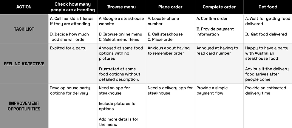
User journey map for Rachel
Goal : An easy way to order food for a house party

Wireframing
Paper Wireframes
Through an iterative process that involved crafting multiple drafts and taking into account user pain points, I created a portfolio screen that not only addresses user needs but also incorporates aesthetically pleasing elements. In particular, I prioritized a clean and organized design for the home screen, marking stars for standout designs among the sketches I created.

Digital Wireframes


Low-Fidelity Prototype
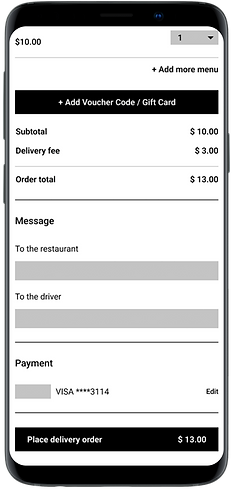
By utilizing the completed set of digital wireframes, I crafted a low-fidelity prototype with a focus on the order process, enabling its usage in a usability study.

Usability test
Participants
-
5 Participants
-
2 males, and 3 females between the ages of 20 - 60
Research Questions
-
What can we learn from the user flow, or the steps that users take, to order food?
-
Are there parts of the user flow where users get stuck?
-
Are there more features that users would like to see included in the app?
-
Do users think the app is easy or difficult to use?
Methodology
-
10 to 20 minutes per participant
-
Korea, remote
-
Unmoderated usability test
-
Users were asked to perform tasks in a low-fidelity prototype
Round 1 Findings with low-fidelity designs and prototypes
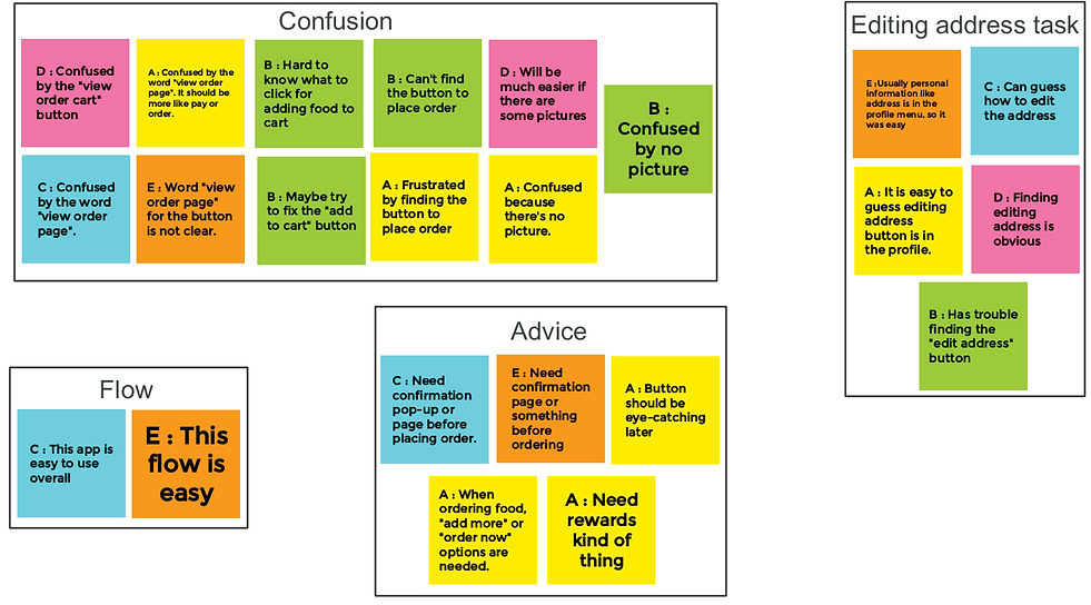
Affinity Diagram
I conducted a usability study using low-fidelity wireframes to understand how users experience my design. I organized the data into groups based on common themes and relationships, using an affinity diagram for quick and efficient sorting. The study findings guided the design process from wireframes to mockups.

Prioritized Insights
Priority 0


1. Most users thought the word 'view order cart' on the button should be clear
-
4 out of 5 participants were confused by the word 'view order cart' on the button when they placed an order.
-
Insight: To address the need for a clearer label on the order button, I revised the wording.
"I don't like the phrase 'view order page'. It's kind of confusing. It should be more like 'pay' or 'order', maybe?"


2. Participants thought it’s hard to find “add to cart” button
-
2 out of 5 participants thought it was hard to find a button for adding food to cart.
-
Insight: The "add to cart" button did not stand out enough, so I moved its position to be fixed when scrolling.
"I'm not sure what to click"
Priority 1

1. Several people were frustrated by the process of placing an order without a confirmation page.
-
2 out of 5 participants expressed frustration about the process of placing an order without a confirmation page.
-
Insight: To address the need for a confirmation page before placing an order, I added a pop-up message after the order button is pressed.
"There should be an additional confirmation pop-up or page before finalizing an order."

Round 2 Findings with high-fidelity designs and prototypes
I created high-fidelity designs and prototypes based on the revised low-fidelity prototypes from the 1st round of usability test. I then conducted a 2nd round of usability test with the high-fidelity prototypes, which allowed me to identify the areas that needed further refinement.
1
In earlier designs, users had to go to the 'My Orders' section of the 'My Account' page to check their order status. However, after conducting a usability test, I added a 'Track My Order' button on the homepage, allowing users to quickly check their order status without navigating to another page.


2
The second round of usability study revealed that users had difficulty returning to the home page.
To address this issue, I added a 'Home' menu with an icon on the 'My Account' page, allowing users to easily navigate back to the homepage.


Final polished designs
Key Mockups


High-Fidelity Prototype
The final high-fidelity prototype features clean and simple user flows for the ordering process and checkout, as well as a convenient order tracking feature.

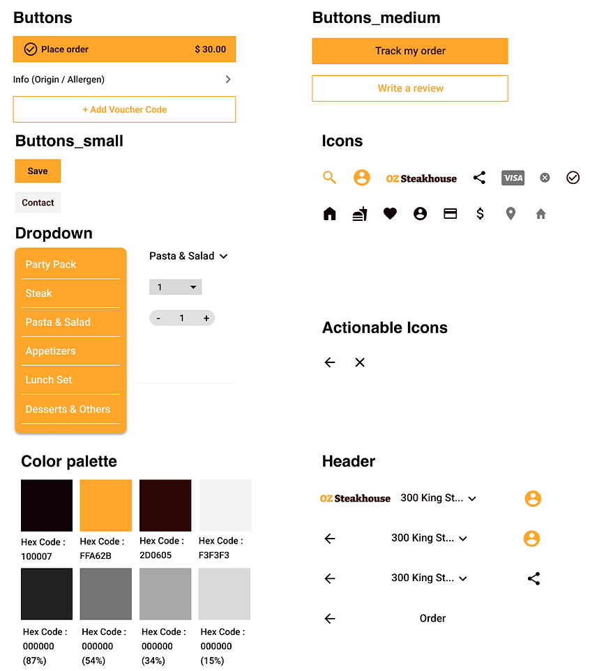
Sticker sheet

What I learned
Although I initially believed that my design for the OZ Steakhouse app was easy to use, the feedback from the usability test revealed issues that I was unaware of. This experience taught me the importance of user feedback, as it showed me that I cannot always identify the issues faced by users from the designer's perspective.